I. DFT 신호처리
코사인 파형을 예로 디지털 퓨리에 변환 코드를 작성해 보자.
필요한 라이브러리는 numpy, matplotlib 및 fft 이다.
디지털 퓨리에 변환을 위한 fft 지원을 위해서는 아나콘다 가상환경에 scipy 가 미리 설치되어 있어야 할 것이다.
import numpy as np
import matplotlib.pyplot as plt
from scipy.fftpack import fft
파형 시각화를 위하여 carrier 의 주파수 fc 값을 실 예로 10Hz로 설정하자.
Nykist criteria에 의하면 적어도 설정된 주파수의 2배 이상이 되도록 샘플링율을 설정할 필요가 있다.
여기서는 샘플링 율을 carrier 주파수 fc를 기준으로 L값(oversampling rate)을 1~10 범위에서 시험해 보기로 한다.
시간 구간은 (0.0, 10) 초 사이에서 스텝은 샘플링 율의 역수로 한다.
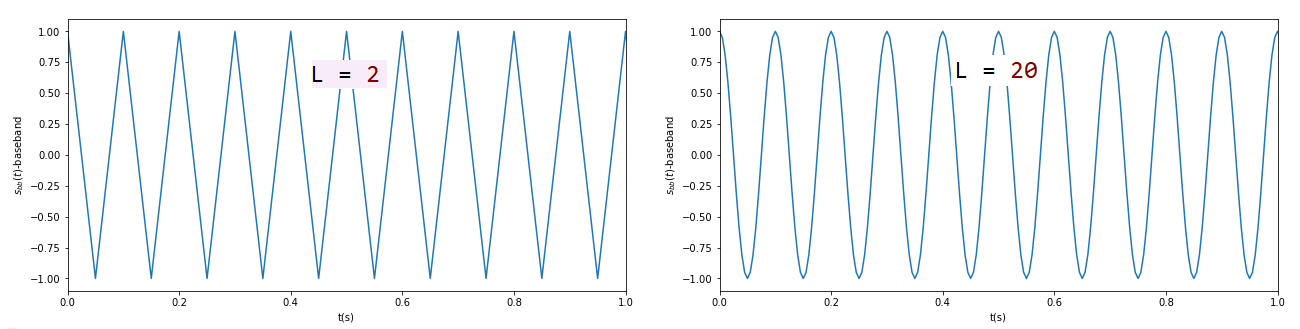
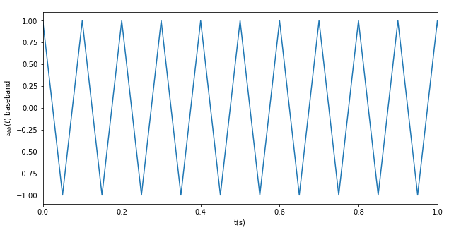
작도할 코사인 파형은 진폭 1.0으로 한다. L 값이 작으면 코사인 파형이 삐죽삐죽하게 표현되므로 부드러운 곡선으로 시각화하려면 L 값을 증가시켜야 한다.
fc=10 # frequency of the carrier
L = 4
fs=L*fc # sampling frequency with oversampling factor
t=np.arange(start = 0,stop = 10, step = 1/fs) # 2 seconds duration
s=np.cos(2*np.pi*fc*t)
L 값 변화에 따른 코사인 파형의 모습
준비된 코사인 파형을 대상으로 디지털 퓨리에 변환을 계산하자.
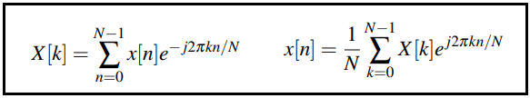
Scipy에서 지원하는 FFT 는 Cooley & Tuckey 알고리듬을 사용하며 다음과 같이 기술된다.
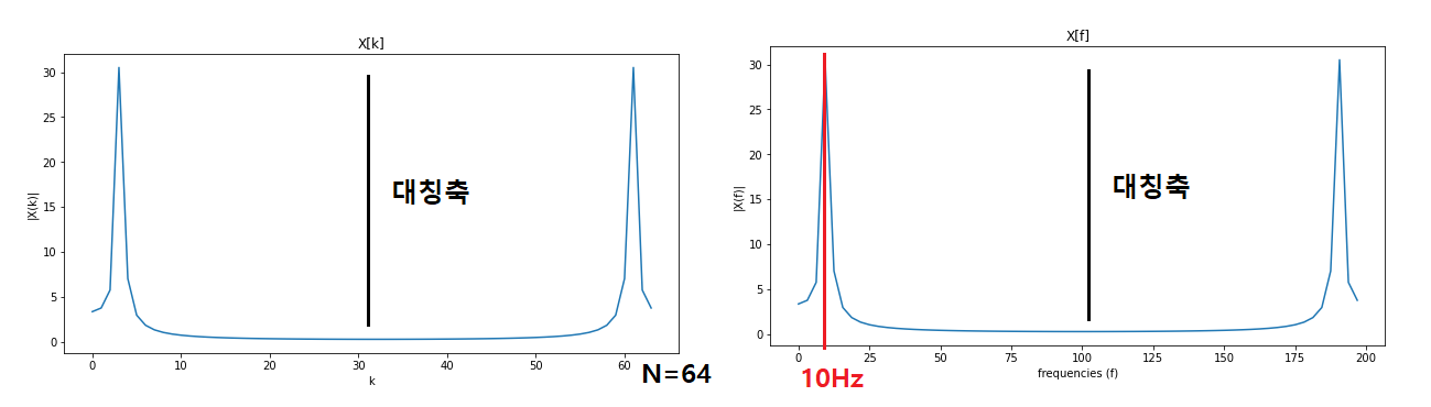
FFT 크기는 N 값으로 설정하며 2의 정수배 값 즉 64, 128, 256,...을 취한다.
df=fs/N 은 주파수 해상도를 의미한다. 현재의 64개 FFT 계산에서 코사인 파형의 주파수가
앞서 준비된 파형신호 s와 FFT 규모를 argument로 scipa 함수의 FFT를 호출하자.
FFT 계산 결과는 k=0,1,2,...,N-1 를 가로 좌표축으로 하여 X[k] 값을 그래프로 나타낸다. 한편 주파수 해상도를 사용하여 k에서 f(frequency) 로 변환하여 나타낼 수도 있다.
fig2 = plt.figure(figsize=(10,5))
N=64 # FFT size
X = fft(s,N) # N-point complex DFT, output contains DC at index 0
df=fs/N # frequency resolution
sampleIndex = np.arange(start = 0,stop = N) # raw index for FFT plot
f=sampleIndex*df # x-axis index converted to frequencies
plt.plot(sampleIndex,abs(X))
plt.title('X[k]')
plt.xlabel('k')
plt.ylabel('|X(k)|')
fig3 = plt.figure(figsize=(10,5))
plt.plot(f,abs(X))
plt.title('X[f]')
plt.xlabel('frequencies (f)')
plt.ylabel('|X(f)|')
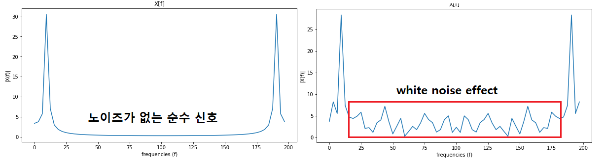
계산 결과를 k 또는 f 의 항으로 볼 수 있다. 현재 코사인 파형이 10Hz 인 점을 감안하면 아래 오른쪽 그래프에 잘 나타나 있다. 특이할 점은 190Hz 위치에도 스펙트럼 피크 값이 있는데 이는 FFT 알고리듬에 의한 계산 결과가 대칭 축을 중심으로 대칭적인 결과를 주므로 한쪽만 해석상 의미가 있는 것으로 봐야 할 것이다.
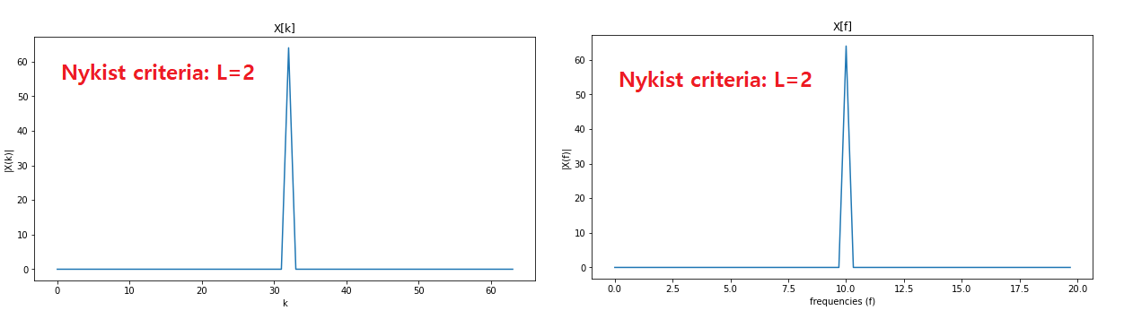
한편 Nykist criteria 인 L=2 인 경우의 스펙트럼을 관찰해 보자. 오른쪽 그래프를 보면 정 중앙에 10Hz 를 나타내고 있다. 즉 Nykist criteria 해당하는 샘플링 율에 대해서 까지는 정확한 주파수를 나타내고 있다. 아울러 이 위치는 대칭 축의 위치이며 각 스펙트럼의 값이 30 이므로 합해서 60의 값을 주고 있다.
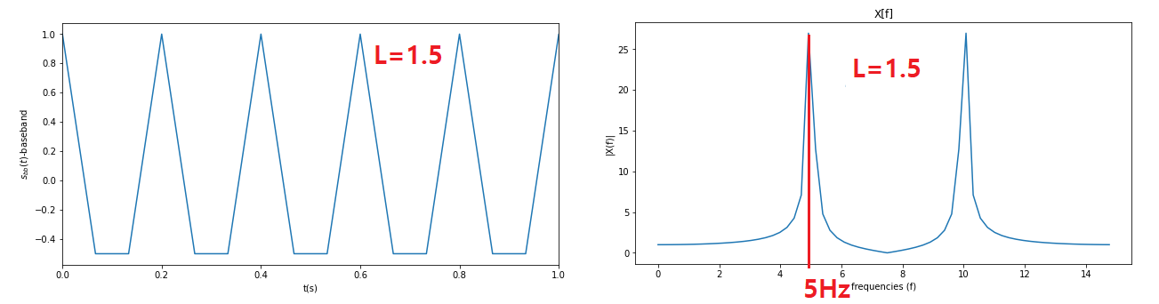
L=2에서 파형은 다음과 같이 간신히 특징만 보여주는 정도이며 이 이하로 샘플링 하면 파형의 의미가 사라질 것이다.
L=1.5인 경우에 제대로 된 파형을 보여주지 못하며 FFT에 의해 체크 된 주파수도 5Hz 로 10HZ와는 거리가 멀다.
첨부된 파일( DFT_Cosine.py )을 다운받아 아나콘다에서 실행시켜보자.
#DFT_Cosine.py
import numpy as np
import matplotlib.pyplot as plt
from scipy.fftpack import fft
fc=10 # frequency of the carrier
L = 1.5 # oversampling factor
fs=L*fc # sampling frequency with oversampling factor
t=np.arange(start = 0,stop = 10,step = 1/fs) # 2 seconds duration
s=np.cos(2*np.pi*fc*t)
# Waveforms at the transmitter
fig1 = plt.figure(figsize=(10,5))
plt.plot(t,s) # baseband wfm zoomed to first 10 bits
plt.xlabel('t(s)');plt.ylabel(r'$s_{bb}(t)$-baseband')
plt.xlim(0,1)
plt.show()
fig2 = plt.figure(figsize=(10,5))
N=64 # FFT size
X = fft(s,N) # N-point complex DFT, output contains DC at index 0
df=fs/N # frequency resolution
sampleIndex = np.arange(start = 0,stop = N) # raw index for FFT plot
f=sampleIndex*df # x-axis index converted to frequencies
plt.plot(sampleIndex,abs(X))
plt.title('X[k]')
plt.xlabel('k')
plt.ylabel('|X(k)|')
fig3 = plt.figure(figsize=(10,5))
plt.plot(f,abs(X))
plt.title('X[f]')
plt.xlabel('frequencies (f)')
plt.ylabel('|X(f)|')
II. AWGN 화이트 노이즈 추가 효과
이어서 코사인 파형에 적정한 dB 크기로 생성된 AGWN 신호 n을 코사인 파형 신호 s에 더하여(add) 출력해서 관찰하고 아울러 DFT 처리하여 white noise 특성이 어떻게 나타나는지 살펴보자.
AGWN 효과를 가시화 해보기 위해서 라이브러리를 추가하고 라이브러리 다음의 헤더 영역에 약간의 코드를 추가하기로 한다.
SNRdB = 2: 신호 대비 잡음 비를 2 dB 로 둔다.
gamma = 10**(SNRdB/10) #SNR to linear scale
P=L*sum(abs(s)**2)/len(s) # 신호 s의 파워스펙트럴 덴시티 계산
N0=P/gamma # Find the noise spectral density
n = 0.3*sqrt(N0/2)*standard_normal(s.shape): Guassian 분포에 표준편차(sqrt(N0/2))만큼의 진폭에
가시화 정도를 조절하기 위한 임의의 계수 0.3
s = s+ n # signal + Gaussian white noise
fc = 10 Hz에 oversapling rate L = 20 인 경우에 코사인 파형 s=np.cos(2*np.pi*fc*t) 과 white noise 를 탄 파형을 plot 하자.
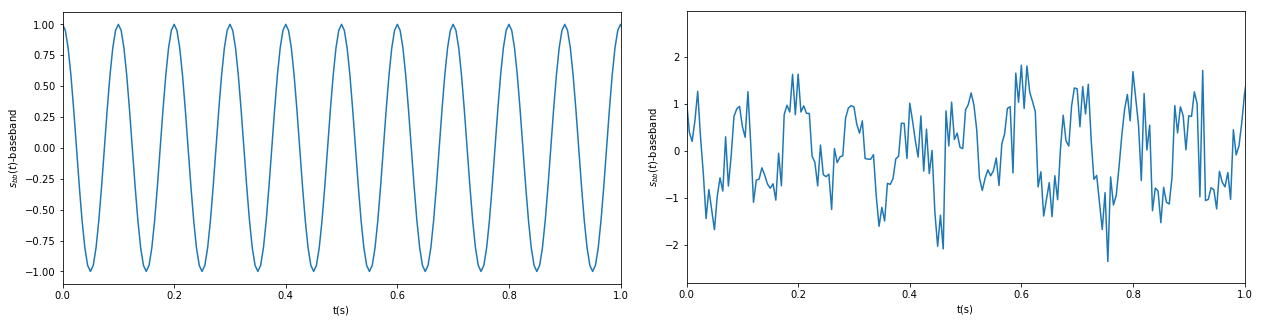
순수 신호 파형에 대한 스펙트럼 및 white noise 를 탄 파형에 대한 스펙트럼을 plot 하자. 0.3*... 효과를 반영한 화이트 노이즈를 관찰할 수 있다.
코드 해설 영상 다음에서 보기: YouTube 클릭 참조하세요. 구독 좋아요 부탁드려요.
#DFT_Cosine_AGWN.py
import numpy as np
import matplotlib.pyplot as plt
from scipy.fftpack import fft
from numpy import sum,isrealobj,sqrt
from numpy.random import standard_normal
fc = 10 # frequency of the carrier
L = 20 # oversampling factor
fs=L*fc # sampling frequency with oversampling factor
t=np.arange(start = 0,stop = 10,step = 1/fs) # 2 seconds duration
s=np.cos(2*np.pi*fc*t)
# Waveforms at the transmitter
fig0 = plt.figure(figsize=(10,5))
plt.plot(t,s) # baseband wfm zoomed to first 10 bits
plt.xlabel('t(s)');plt.ylabel(r'$s_{bb}(t)$-baseband')
plt.xlim(0,1)
plt.show()
SNRdB = 2
gamma = 10**(SNRdB/10) #SNR to linear scale
P=L*sum(abs(s)**2)/len(s) #Actual power in the vector
N0=P/gamma # Find the noise spectral density
n = sqrt(N0/2)*standard_normal(s.shape)
s = s + n
# Waveforms at the transmitter
fig1 = plt.figure(figsize=(10,5))
plt.plot(t,s) # baseband wfm zoomed to first 10 bits
plt.xlabel('t(s)');plt.ylabel(r'$s_{bb}(t)$-baseband')
plt.xlim(0,1)
plt.show()
fig2 = plt.figure(figsize=(10,5))
N=64 # FFT size
X = fft(s,N) # N-point complex DFT, output contains DC at index 0
df=fs/N # frequency resolution
sampleIndex = np.arange(start = 0,stop = N) # raw index for FFT plot
f=sampleIndex*df # x-axis index converted to frequencies
plt.plot(sampleIndex,abs(X))
plt.title('X[k]')
plt.xlabel('k')
plt.ylabel('|X(k)|')
fig3 = plt.figure(figsize=(10,5))
plt.plot(f,abs(X))
plt.title('X[f]')
plt.xlabel('frequencies (f)')
plt.ylabel('|X(f)|')
본 내용에 이어서 FFT 주파수 스펙트럼의 Shift 작업에 관해서는 다음 블로그를 참조하세요.
FFTShift : http://blog.daum.net/ejleep1/1259
Under construction ...
'통신' 카테고리의 다른 글
| Differential BPSK(DBPSK) 변조 (0) | 2022.03.25 |
|---|---|
| Constellation Diagram 과 QPSK(Quadruple Phase Shift Keying) , QAM(Quadrature Amplitude Modulation) 해설 (0) | 2022.03.24 |
| BPSK 변조에서 AGWN(Eb/No)노이즈에 의한 BER 이론 계산 (0) | 2022.03.12 |
| Binary Phase Shift Keying(BPSK) 변조 (0) | 2022.03.12 |
| 노이즈 탄 데이터 식별을 위한 Autoencoder 알고리듬 이용 (0) | 2022.03.01 |